
I built Minesweeper (pixel-perfect based on the Windows XP version) using React. I also added the ability to flag or chord on mobile using long-press. You can play with it here: https://leyanlo-minesweeper.netlify.app/. The code is on GitHub.
Building Minesweeper is a popular software engineering interview question (e.g. Google, LeetCode). I wanted to see how far I could take it building a pixel-perfect app, as well as use it as an excuse to play with some new technologies.
Technologies I used
- TypeScript as language
Fairly similar to Flow, except much more popular and well-supported. Nice thatenumis both a type and an object. - Emotion for styling
Love how small and fast it is. Mainly used thecssprop to style elements and avoided styled components altogether because I hate that as a pattern. (It adds an unnecessary layer of abstraction between the DOM and the styles). Didn’t get into theming, but it seems like it would have been pretty straightforward. - React hooks for application state
I love how I do not need to install redux and can store everything I need using hooks. - Gatsby for generating the app
Gatsby is the best. Compiles the React app and serves exactly the HTML/CSS/JS needed by the client, including all font and image assets, in under 200 KB. - Netlify for automated deploys
I can push a commit to GitHub, and Netlify will start a new build and deploy the app. Amazing.
Pixel-perfect based on what?
When I started working on Minesweeper, I wanted to build it as accurately as possible. Unfortunately, there are tons of variations to choose from.
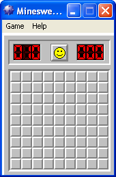
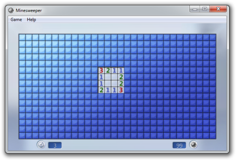
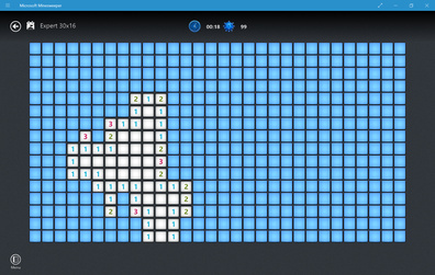
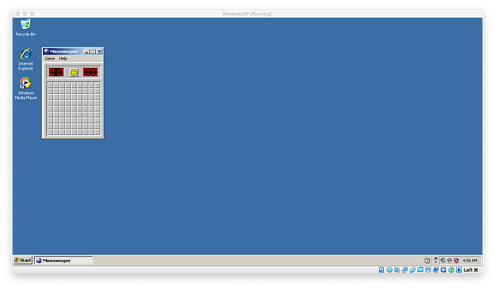
I ended up aiming for the Windows XP version. In order to make sure I was getting everything right, I installed a Windows XP virtual machine on my Mac. Luckily, I was able to follow this guide to get up and running.
Things I learned about Minesweeper
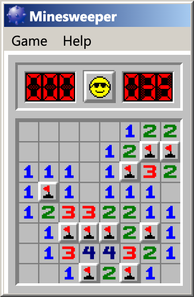
- There is a weird 3px white border on the top and left side of the game. I assume this would be to show depth, but there is no equivalent gray border on the bottom or right side. I never noticed this growing up, but it looks like a bug!
- Clicking with both the left and right mouse buttons to open up the neighboring cells is called a Chord.
- There’s a technique called the 1.5 Click where you flag, drag, and click in a continuous motion in order to save time.
- It is impossible to lose on the first click.
Things I did


- At first, I tried being clever, using emoji for the face button and a special typeface for the numbers. This ended up with way too many inconsistencies across browsers and OSes, so I ended up drawing bitmaps based on the original. In order to avoid blurriness when zooming in, I converted all of the bitmaps into SVGs, which are resolution-independent.
- The HeadingNumber component takes in a number and returns the three SVGs used in the mine count or the timer. Found out that in Minesweeper, negative numbers are possible for the mine count if you misflag a few extra mines. Also, all numbers are clamped within the range from -99 to 999.
- Started out storing game state with multiple
useStates, but things got a little messy as I had to keep track of more and more things, e.g. the board, which cells are revealed, whether you’re in the middle of a click, the timer, whether you’ve won, etc. Updated to usinguseReducerin order to keep track of everything at once, but this ended up a little messy as well, having to pass the reducer and state to every component, leading to Prop Drilling. Finally ended up moving the reducer and state to a React context, which can be imported by any component usinguseContext. - I wanted to be able to play on my phone, so I added a couple of long-press enhancements for mobile, allowing players to flag or chord on mobile.
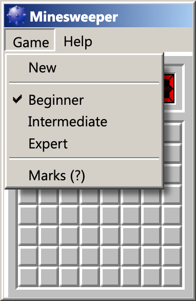
- Building the Windows XP UI is hard! I spent a ton of time on the Game menu. All menus have box shadows. They take 150ms to fade in, but disappear immediately. There’s also a bunch of keyboard support that I didn’t implement, like arrow keys or alt-key shortcuts.
Conclusion
This was a fun project and I was glad to have an excuse to play with new technologies. If I come back to this, I would want to add the best times scoreboard, sounds, and maybe implement keyboard accessibility for the menu (essentially building Windows in JS).
